How to use the color wheel for outfits
The color wheel explains why some pairings feel calm and others feel bold. On its own, though, it suggests outfits nobody would wear: pure red with pure green, full orange with full blue. The trick is to use it for direction, then translate the hues into clothing colors.
Complementary from red
Opposites. In clothes, mute one side and keep the other small.
The swatches in the middle are the neutrals: they sit outside the wheel and go with every scheme.
Which color wheel to use
There are two common wheels. The painter's wheel uses red, yellow and blue as primaries and puts red opposite green, orange opposite blue and yellow opposite purple. Screen and printing wheels use other primaries and put red opposite cyan. Most fashion and styling advice, including this site, refers to the painter's wheel, and that is the one in the tool above.
Either way, the wheel only describes hue. Two other properties matter at least as much in clothes: value (how light or dark a color is) and saturation (how intense or muted it is). Navy and cobalt share a hue but behave completely differently in an outfit.
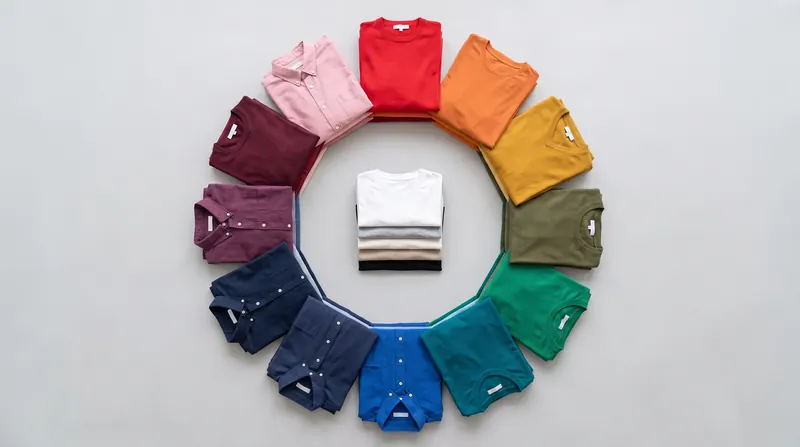
The five schemes, translated into outfits
Complementary: opposites
Two colors from opposite sides of the wheel: blue and orange, red and green, yellow and purple. At full strength they are loud, which is why complementary outfits usually mute one or both sides. Navy with rust, burgundy with olive and plum with mustard are all complementary pairs that look grown-up. Another trick is to keep one side small: a navy outfit with a rust scarf.
Analogous: neighbors
Two or three colors next to each other: yellow, yellow-orange and orange, or blue, blue-green and green. Analogous outfits feel calm and cohesive. Make one color clearly darker so the outfit has depth, such as rust trousers with a mustard knit and a cream shirt.
Split complementary: softer contrast
Your color plus the two neighbors of its opposite. Instead of blue with orange, you get blue with red-orange and yellow-orange, which in clothes might be denim with rust and mustard. It gives contrast with less tension than a straight complement.
Triadic: three evenly spaced hues
Red, yellow and blue, or orange, green and violet. Triadic outfits are bold and work best when one color dominates and the other two are small, or when all three are muted: burgundy, mustard and navy is a triad most people would happily wear.
Monochrome and tonal: one hue, several depths
One hue from pale to deep: light blue, cobalt and navy, or blush, pink and burgundy. It looks considered and lengthens the silhouette. Texture is what keeps it interesting, so mix knit, cotton, wool and leather.
Where neutrals fit
White, cream, beige, grey, charcoal, black, brown, camel and navy sit outside the wheel in practice. They have little or no hue, or a hue so muted that it does not compete. That is why you can add a neutral to any scheme without breaking it, and why most real outfits are one scheme plus neutrals.
Neutrals still have a temperature. Cream, camel, beige and brown are warm; white, grey, charcoal and black are cooler; navy is cool but pairs well with warm colors. Matching the temperature of your neutrals to your main color is a quiet way to make an outfit look cohesive.
Saturation and value do most of the work
Ask why burgundy and olive look good together while bright red and kelly green look like a holiday sweater. The hues are the same pair of opposites. The difference is saturation and value: the muted, deep versions sit quietly next to each other, the bright ones compete.
A useful habit: when the wheel suggests a pairing, try the muted or deep version of each color first. Orange becomes rust or camel, yellow becomes mustard or cream, green becomes olive or forest, blue becomes navy or denim, purple becomes plum or lavender.
Using the wheel with your own clothes
- Pick the piece you want to build around and find its hue on the wheel.
- Choose a scheme: complementary for contrast, analogous for calm, monochrome for a tonal look.
- Translate each hue into a clothing color (the tool lists common ones).
- Let one color lead, keep the others smaller or more muted, and fill the gaps with neutrals.
- Check the result in daylight, or try it on a photo of yourself.
For a shortcut, the matcher already does this translation for 30 common clothing colors and adds a reason for every pairing. The guides go further for navy, olive green, burgundy, beige and grey.
See a color scheme on yourself
Upload a photo of yourself and a photo or shop link of a garment; FitInView shows you wearing it. Handy for checking a color pairing before you buy.
Your first try-on is included with a free account. No card needed. Your photos are private to your account, and you can delete them.